Omega SA opposed an application to register the mark shown to the right, for jewelry, claiming a likelihood of confusion with its registered and common law marks (shown below) for watches and watch parts, for jewelry. The Board found the goods to be identical and/or closely related (not surprisingly), and Opposer’s marks to be famous for Section 2(d) purposes. But are the marks confusingly similar? Well, close enough to result in a divided panel decision. Omega SA (Omega AG) (Omega LTD.) v. Derral Leon Reynolds, Opposition No. 91197643 (September 12, 2016) [not precedential].
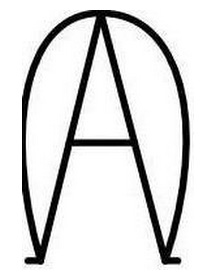

The panel majority observed that “[t]he Lanham Act’s tolerance for similarity between competing marks varies inversely with the fame of the prior mark.” [Strike One?] Moreover, when the involved goods are identical, a lesser degree of similarity between the marks is needed to support a finding of likely confusion. [Strike Two?] And in his application, Applicant Reynolds stated that his mark consists of “the Greek letter Alpha nestled inside of the Greek letter Omega.” [Strike Three?]
Consumers will likely pronounce Opposer’s marks as “omega.” Applicant, by his statement, considers the letter “Ω” to be a readily discernable part of his mark. “If he articulates the ‘omega’ component of his mark, as he does in the description of his mark, it is likely that his consumers will also articulate the ‘omega’ component of his mark.” [That seems like a nonsequitur to me – ed.].
The panel majority found that the Greek letter “Ω” is readily recognizable in Applicant’s mark, surrounding the “A” or “alpha.” Thus the involved marks are similar in appearance because they both include “Ω”. Even when consumers note the “alpha” element in applicant’s mark, they are likely to see the mark as a variation of opposer’s well known Omega marks.
Balancing the relevant factors, the panel majority found confusion likely and so it sustained the opposition.
Dissent: Judge Francie R. Gorowitz dissented, concluding that the marks are so different that confusion is unlikely. She asserted that the majority put too much weight on applicant’s description of his mark, when the important issue is the public’s perception of the mark and not applicant’s description. She opined that consumers would not likely perceive the curve around the “A” as the letter omega, but rather would see the mark as a capital “A” with a slight design element.